
Charts are a useful way to visualize and analyze data, but with so many different chart types, it can be hard to decide which one is right for your data. Waterfall charts are a type of graph used to visualize how a value changes from one point to another. They are often used to show how a company’s sales or profits have changed over time. Keep reading to learn more about waterfall charts and how they can be used to visualize data.
What is a waterfall chart?
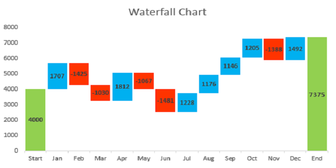
Waterfall charts are a graphical representation of the cumulative effect of positive and negative values. The waterfall chart begins with a total value at the top and then successively breaks down the total into its parts. This type of chart is often used to illustrate how changes in one part of a business can affect other parts. For example, you might use a waterfall chart to show how profits are affected by revenue, costs, and taxes.
Waterfall charts can be helpful when trying to understand how a particular change or event has affected an overall trend. They can also be used to track how different parts of a system are working together to produce an outcome. This type of chart is often used in financial analysis but can be applied in other areas as well.
How to create a waterfall chart.

To create a waterfall chart in Excel, you need to use the data table function. This table will allow you to input your data in rows and then create the chart using those values. To set up the data table, start by creating two columns: one for your positive values and one for your negative values. In the first row of the table, input the initial or starting value for your waterfall chart. In subsequent rows, input each positive or negative value that will impact the overall value.
Once you have entered all of your data into the table, select it and go to Insert > Charts > Waterfall Chart. Excel will automatically create the chart based on your data table.
How to read a waterfall chart.
The waterfall chart is divided into five sections: the title, the x-axis (time), the y-axis (value), the legend, and the annotations. The title section includes the name of the chart and its creator. The x-axis measures time in chronological order, with earlier times at the bottom of the chart and later times at the top. The y-axis measures value, with higher values on the right side of the chart. The legend identifies each series in the chart and its color. The annotation section includes any notes about how to read or interpret the data in the chart.
Adjusting the height of columns in a waterfall chart can make it easier to read: Just select the column and then use the mouse to drag its top border up or down.
Additional tips for formatting your waterfall chart.

Waterfall charts are a great way to visualize how different parts of your business impact your bottom line. They can be used to track everything from sales and revenue to expenses and net income. To modify the appearance of your waterfall chart, you can use the options found in the Design and Format tabs.
Here are some additional tips for creating an effective waterfall chart:
- Change the colors of each section of your waterfall chart by clicking on one of the sections and then selecting a color from the palette that appears.
- To change the data that is displayed in your waterfall chart, edit the data in the underlying table.
- To add labels to your waterfall chart, select the chart, and then click the Layout tab. In the Labels section, select the check box next to Show Legend.
Masstamilan is a popular website that offers Tamil songs for free downloads. It is a go-to platform for Tamil music lovers to find their favorite tracks easily.